When it comes to designing digital products, forms have an important role to play. Whether buying something online, creating a new account, or reaching out with an inquiry; well-designed forms are essential for a seamless user journey.
If you want to ensure a positive user experience that drives conversions, you must master the art of form design — and we’ll show you how in this guide.
Keep reading to learn everything you need to know, including practical tips, best practices, and real-world examples.
What is form design and why does it matter?
Form design is all about creating forms that are relevant, functional, user-friendly, and visually aligned with the overall brand.
Just like icon design, typography, or card design, form design is an important aspect of UI design with its own rules, guiding principles, and best practices. It considers the structure, layout, and content of the form — ensuring it’s optimised for the context, the user, and the task they want to complete.
How you design your forms can ultimately make or break the user experience. This, in turn, has a major impact on the overall success of your product.
Imagine a customer wants to buy something from an e-commerce store. They get to the checkout page, excited to purchase their new products, only to be met with a long, confusing, and slow-loading form. After a minute or two, they give up altogether.
For the company behind the form, that’s a valuable customer — and money — lost. Not to mention a dent in their brand reputation.
That’s the danger of a poorly designed form. But, when you adhere to the principles and best practices of good form design, you can:
- Ensure an easy, inclusive, and accessible user experience
- Boost customer satisfaction to drive conversions and revenue
- Build trust with your end users and enhance the brand reputation
Form design matters, and we’ll show you how to get it right a bit later on in our guide. First, let’s consider the different types of form design most commonly found on the web.
What are the different types of form design?
To design effective forms, you must first understand the context and purpose of the form in question. Different types of forms are used for different tasks and objectives — such as enabling a user to complete a purchase, for example, or collecting customer data.
Here are some of the most common types of form design and where you might find them:
- Registration and sign-up forms. These are used when creating a new account or signing up for a service. If you wanted to sign up for a dating app, for example, you’d need to complete a registration form.
- Log-in forms. These allow existing and returning users to log into their account quickly and securely. Think logging back into your LinkedIn account, for example.
- Application forms. Most commonly used on job sites and hiring portals (e.g. Indeed), application forms guide users through a specific application process. These types of forms tend to be longer than most, and should allow the user to upload files such as a CV or cover letter.
- Contact forms enable users to reach out for support or express interest in a product or service. If you’re a freelancer, you might embed a contact form on your portfolio website to encourage potential clients to contact you.
- Checkout forms. These are essential for driving conversions on e-commerce websites and online stores. Checkout forms gather billing, shipping, and payment information to help complete a purchase.
- Lead generation forms are used to capture contact information from potential customers in exchange for some kind of user value — like a downloadable e-book or a free trial.
- Surveys and questionnaires. These types of forms are used to gather customer feedback and reviews, often as part of ongoing research and testing. You might be asked to fill out a quick survey after making a purchase, for example.
Each form type has its own unique needs and goals. But, no matter what kind of form you’re designing, there are certain principles that apply across the board. Let’s dive into those now.
The fundamental principles of effective form design
Here are eight fundamental principles to keep in mind when designing forms for the web.
Clarity and simplicity
The best forms are clear, simple, and straightforward. Users should know exactly what information is required of them and why, and they shouldn’t have to think twice about how to complete the form.
This includes providing clear field labels, using simple and jargon-free language, and offering helpful tips and instructions where necessary.
Accessibility and inclusivity
Forms should be designed so that they’re accessible to all users — be that a person using a screen reader or someone trying to fill out the form on their phone.
Accessible and inclusive form design considers things like inclusive language, easily readable fonts, sufficient colour contrast, and screen reader compatibility (to name just a few).
Learn more about how to design accessible and inclusive content in this guide.
User control
Good form design puts users in the driving seat, allowing them to navigate, edit, and review their inputs freely and easily. You can prioritise user control by allowing users to save their progress halfway through, return to previous fields or sections, and edit their responses without starting over.
You might include a “Save and continue” button, for example, or allow users to review a summary of their input before pressing “Submit”.
Feedback and confirmation
You want to seamlessly guide your users through the process of filling out a form, reassuring them that they’re on track and moving closer to task completion. A well-designed form does this by providing immediate feedback and confirmation throughout.
Users should see visual cues for correctly completed fields (a green tick next to the input field, for example), receive helpful error messages when issues arise, and get clear confirmation of successful form submission.
Minimal user input
Like most things in UX and UI design, you want to reduce the effort and cognitive load required of the user. You can streamline the form completion process by using autofill options, dropdown selections, and conditional logic to avoid repetitive tasks.
And, most importantly, keep the number of input fields to a minimum. Only ask for information that’s absolutely necessary for the task at hand.
Logical categorisation and information hierarchy
An intuitive, user-friendly form must group information logically and follow an appropriate information hierarchy (usually progressing from “easiest”, such as entering your name and email address, to “hardest”, such as entering credit card details).
Trust and privacy
Depending on the context, filling out a form can feel like a sensitive task — especially if the user is required to enter lots of personal details. A well-designed form should instil trust in the user and reassure them that their data is secure.
This includes explaining why certain pieces of information are needed, and how data will be used, protected, and stored.
Responsive design
All forms should be designed responsively, ensuring they’re fully functional and easy to use on any device and screen size. Mobile-friendly inputs, adaptable layouts, and touch-friendly buttons can all help with consistency and functionality across desktop, mobile, and tablet.
You can think of these principles as the golden rules of form design. Whenever you’re designing a form of your own, refer back to them for guidance to make sure your form design ticks all the boxes.
How to design great forms: 9 tips and best practices (with examples)
We’ve covered the fundamental principles of form design; now let’s consider how you can put them into practice. Follow these actionable steps to design intuitive, user-friendly, and functional forms.
1. Decide what information is absolutely necessary for your form
The first step in designing a great form is to determine what information the form should gather.
In the name of clarity, simplicity, and minimal user input, identify the essential fields required to achieve the form’s purpose — and remove any non-essential fields.
If you’re designing an e-commerce checkout form, for example, ask for shipping and payment details but skip unnecessary data like the user’s date of birth. This helps to streamline the user experience, reduce abandoned cart rates, and boost user satisfaction.
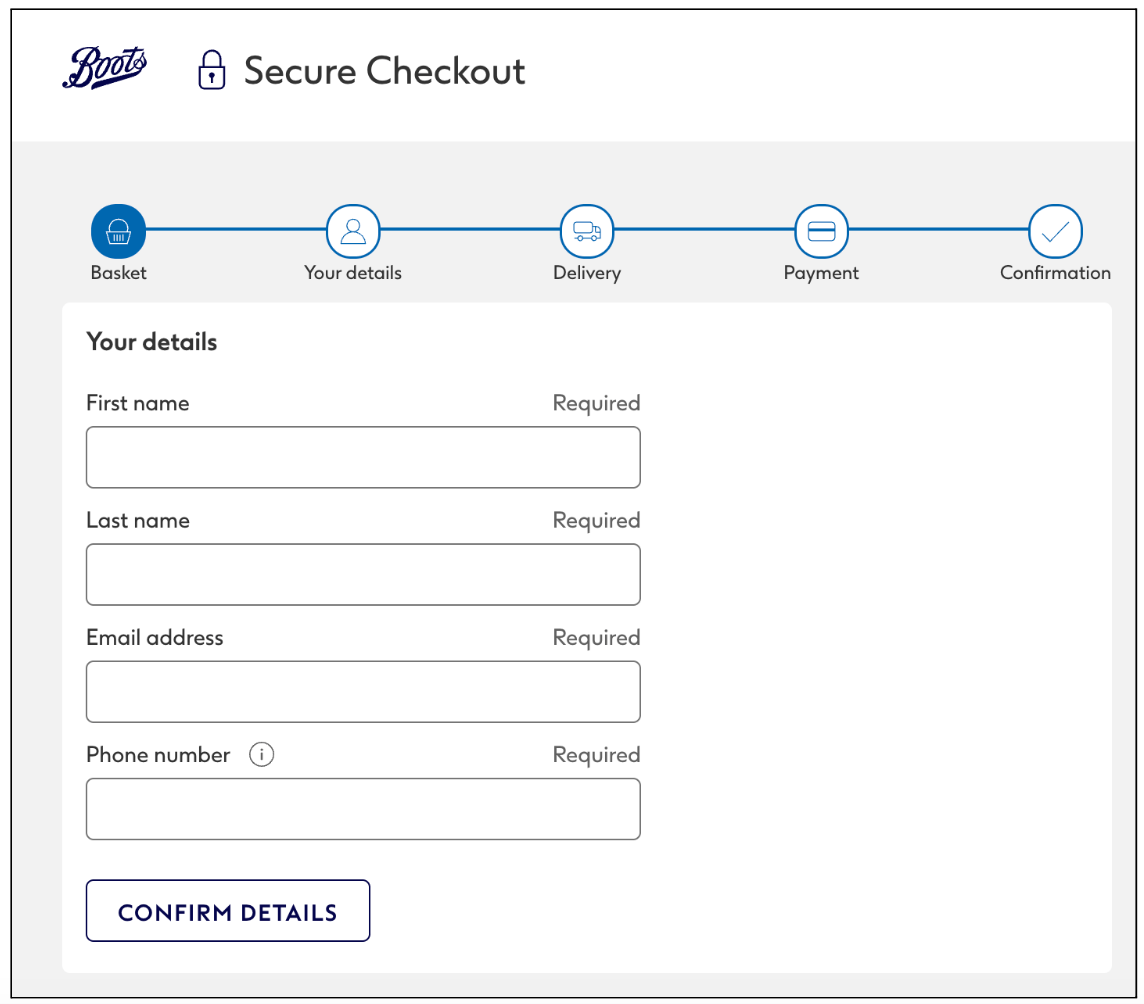
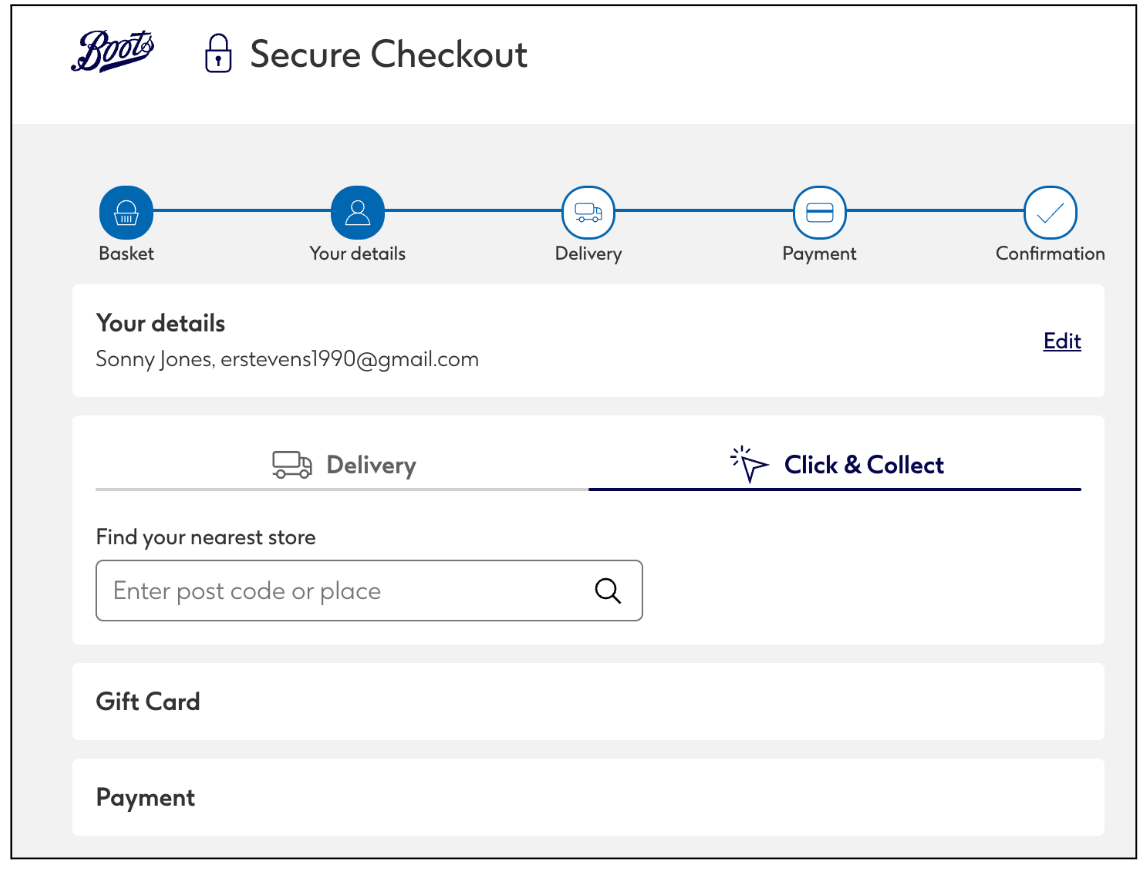
Health and beauty giant Boots uses a simple checkout form, requiring only essential details from the customer. They also break the checkout form down into distinct sections, with a clear overview of the customer’s progress. This makes the purchase process feel quick, manageable, and easy.
2. Organise form fields into logical groups
Next, think about how you’ll categorise and present the information in your form. Group related fields into sections so that there’s a logical and intuitive flow, and consider using headers to clarify each section’s purpose.
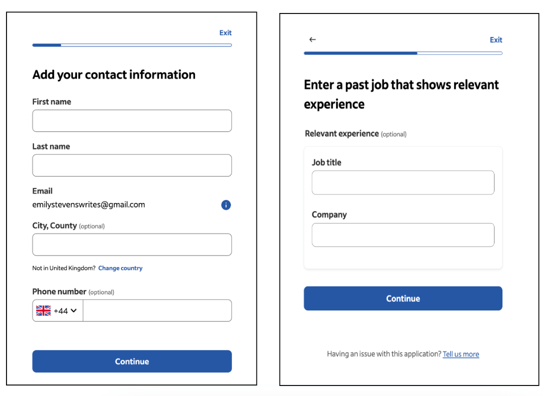
Imagine you’re designing a form for a job application. You might divide the form into sections for personal information, work experience, and education. This makes longer forms feel more manageable, and enables the user to locate relevant fields quickly.
Take this example from job portal Indeed. Each section of the form is focused on a specific step in the application process — breaking it down into logical and manageable units.
3. Use a single-column layout
You want to guide the user through the form in a natural top-to-bottom flow, so stick to a single-column layout. This feels much more intuitive for the user, helps to reduce cognitive load, and maintains clarity and simplicity across all devices (especially mobile).
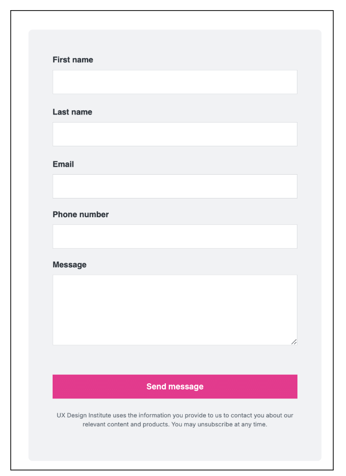
Here is a great example of a one-column form design, found on the UX Design Institute’s ‘contact’ page. This layout creates a simple, logical, and easily-scannable form — increasing the chances that a potential customer will get in touch.
4. Position form labels above input fields — and clearly label any optional fields
Here’s a tip that, while seemingly minor, can make all the difference to the readability and user-friendliness of your form. Rather than placing form labels next to input fields, place them directly above.
At the same time, clearly label any non-essential fields as ‘Optional’. This allows the user to skip unnecessary fields (remember the user control principle?) and increases the likelihood that they’ll complete the form in full.
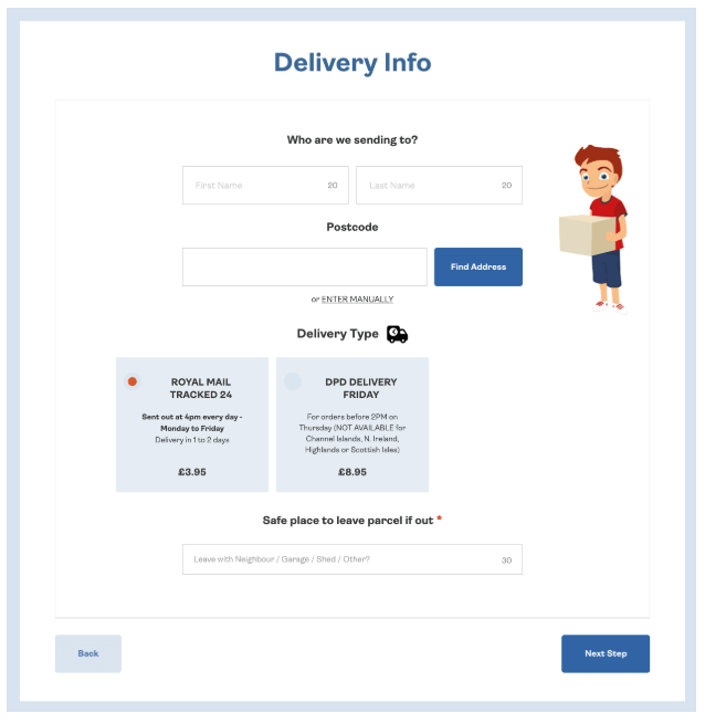
Consider this checkout form on the Wicked Uncle website (a website for ordering children’s toys and gifts). Above each input field, you have a clear label or heading, showing you exactly which input fields belong to which step.
5. Use clear, straightforward language
When designing forms, you want to communicate with the user as clearly, succinctly, and directly as possible. At the same time, you want to ensure that your language is inclusive and accessible.
Avoid technical jargon, use action-focused language that clearly specifies what’s expected of the user, use descriptive and non-ambiguous field labels, write clear and helpful error messages that offer guidance, and generally aim for a positive tone (while keeping in mind the overall brand voice).
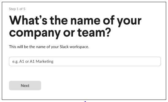
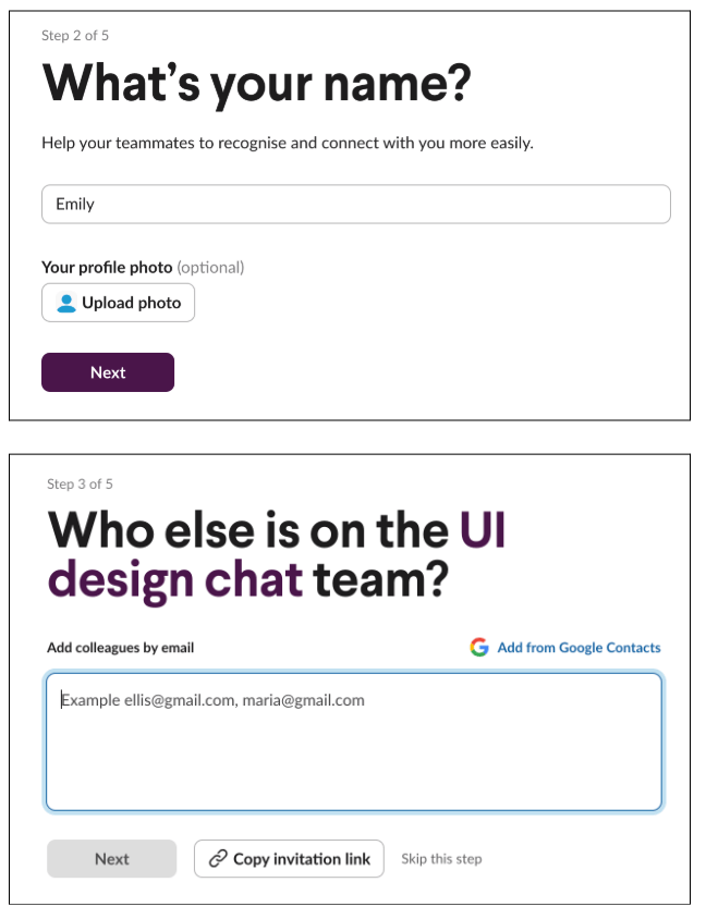
Take inspiration from the popular communication platform Slack. To guide you through the process of creating a Slack workspace, form sections and labels are framed as questions. The user instantly understands what’s required of them and when ensuring a straightforward experience.
For further tips, check out these 7 UX writing guidelines to optimise your web content.
6. Provide additional instructions and guidance where necessary
If there’s any potential for ambiguity or confusion within your form, provide additional tips or instructions that can guide the user.
If certain fields require a specific format — such as a date, phone number, or credit card number — provide inline guidance (i.e. hints and tips within the form field itself) that clearly states how the information should be entered.
You might use placeholder text, info icons that reveal further instructions when the user hovers over them, or hints directly beneath the relevant input field.
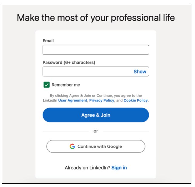
When creating a LinkedIn account, for example, you’re informed that your password must contain at least six characters.
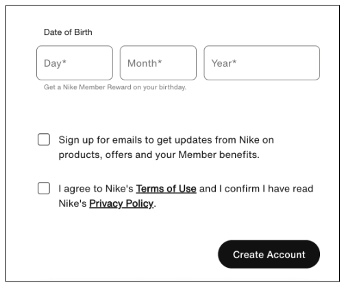
When signing up for Nike Run Club, the form offers additional guidance to specify which data components should go where — like this example where the user can enter their date of birth:
7. Provide feedback and confirmation
Feedback is a fundamental UI design principle. And, in the context of form design, feedback is especially important for reducing errors, enhancing usability, and providing the user with clarity and reassurance throughout.
Imagine spending five minutes filling out a form — with no idea whatsoever whether your inputs are correct and / or successful. That’s pretty unnerving, and could lead you to give up and go elsewhere.
That’s why feedback and confirmation are necessary. When designing forms, integrate immediate feedback for user actions — such as highlighting successfully completed fields, for example, or providing error icons and messages for incorrect or incomplete entries.
If you’re designing a longer, more complex form, you might also include a progress bar. This shows the user exactly where they are in the process, reassuring them that they’re making headway.
8. Tell the user what happens next
Every form serves a purpose, whether that’s helping a customer make a purchase, signing up for a service, applying for a job, or reaching out for support. When designing forms, it’s important to think about what happens next in the user journey — and to communicate that clearly to the user.
Craft a message to confirm that the form has been submitted successfully (e.g. “Thank you!” or “We’ve got your order!”) and explain what happens next.
If the user has signed up for a service, for example, you might inform them that they’ll receive a confirmation email with an account activation link. If they’ve submitted a request for support, you might let them know that a customer service rep will contact them via email in the next 24 hours.
This helps to set clear expectations, provide reassurance, and guide the user to the next step(s) in their journey.
9. Don’t reinvent the wheel
Last but not least: don’t try to reinvent the wheel. Form design is not the time to be overly creative or experiment with novel approaches and layouts.
Simplicity, usability, and functionality are key, and that’s best achieved through familiar design patterns and practices. Your ultimate goal is to help the user complete their task, so stick to established design conventions that feel comfortable and intuitive for the user.
Bear the fundamental principles of form design in mind, follow the steps we’ve laid out in our guide, and take inspiration from existing form designs around the web. This will enable you to meet your users’ expectations, align with their mental models, and design forms that get the job done.
Key takeaways and next steps
Form design is an essential part of creating user-friendly products and providing a positive user experience. Every form serves a purpose, helping the user to complete a specific task and engage seamlessly with the product or service. This is crucial for building trust, driving conversions and revenue, and ultimately establishing a successful brand.
Once you’re happy with your form design, make sure you test it before going live. Run through the form from start to finish, ensuring every step is clear and logical, and check that the necessary actions are triggered when you hit ‘Submit’ — be that receiving a confirmation email or redirecting the user to another page.
You can always A/B test different versions of your form, too, to see what kind of messaging, hierarchy, and sequencing performs best with your target audience. Like most things in UI design, form design should be an iterative process with continuous testing and improvement.
Learn more about UI design
Form design is just one aspect of the broad and varied field that is UI design. For a more comprehensive UI education, check out the Professional Certificate in UI Design offered by the UX Design Institute and credit-rated by Glasgow Caledonian University.
With 3 hours of study over the course of 12 weeks, you’ll learn how to create pixel-perfect digital interfaces — covering everything from layout, design principles, and interactivity, through to presenting your designs and building your professional UI design portfolio.
Want more practical tips and guides to help you level up your UI skills? Continue with the following:
- 8 UI design dos and don’ts (with examples)
- How to use Midjourney AI in UI design
- Designing for mobile: 5 best practices for UI designers


