Accessibility is a huge topic right now. With the European Accessibility Act (EAA) compliance deadline fast approaching in June 2025, the importance of accessible design can no longer be ignored.
But, beyond checklists and regulations, what does accessibility actually mean in practical, real-world terms?
It’s a complex question, so we spoke to an expert with a wealth of knowledge and experience in the field: Skyscanner’s Head of Accessibility and all-round inclusive design champion, Heather Hepburn.
Heather is one of the leading experts the UX Design Institute worked with to create their new course on designing for accessibility.
Here, you’ll find all the highlights from the live masterclass with Heather, hosted by the UX Design Institute’s Head of Product & Research, Rachael Joyce.
Join us for an exclusive deep dive into the fascinating topic of accessibility — and be prepared for some surprising stats, perspective-altering insights, and practical steps you can embed into your own work.
But before we dive in, let’s introduce Heather properly.
Meet Heather Hepburn, Head of Accessibility at Skyscanner
Heather first joined Skyscanner as a UX writer in 2018. But, at the time of her interview, she’d been working at Royal Bank of Scotland on building more accessible account opening systems as a Content Strategist (UX writer) for over 4 years. So, when she was asked to critique the Skyscanner app as part of the interview process, she couldn’t help but notice “a ton of accessibility issues.”
As the company’s unofficial champion for accessible design, Heather eventually established a formal role for herself. For the last five years, she’s been focusing wholly on accessibility at Skyscanner. Heather is also the co-founder of the Champions of Accessibility Network (CAN), a global community with over 2,000 members, and she works closely with universities to address what she calls the “accessibility knowledge gap.”
In her own words, Heather is on a mission to make the world a more accessible place.
So what does that mean exactly, and what does it look like in practice at one of the world’s most successful travel discovery and booking platforms?
Let’s dive in.
Want to play the masterclass webinar in full? You can find it here: What accessibility is and why it matters — a UX Career Masterclass with Heather Hepburn.
Reframing how we define and understand accessibility
If you were asked, right now, to define the terms ‘accessibility’ and ‘disability’, what would you say?
As you contemplate your answer, let’s borrow a quick exercise that Heather ran during the masterclass.
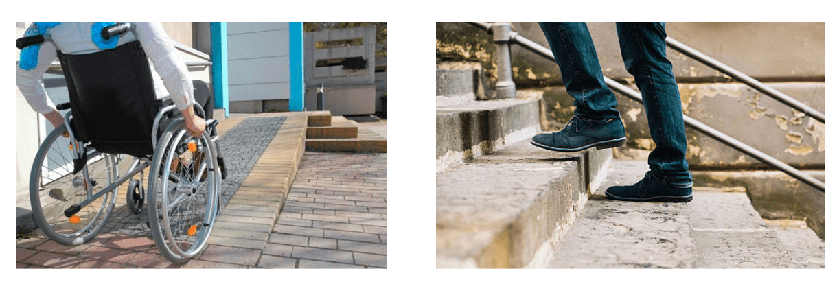
Consider the following images. The first shows a person in a wheelchair, entering a building via a ramp. The second shows another person entering the same building — this time, walking up a set of stairs.
So, who is disabled here?
The answer? In that very moment, neither of these people is disabled. They can both enter the building as there are no barriers preventing them from doing so.
This raises an incredibly important question about how we understand disability.
As Heather points out, many of us tend to view disability and accessibility through the medical model. Through this lens, disability is something that’s caused by a health condition, disease, or trauma.
But, according to Heather, disability is best understood through the social model, where disability is caused by society and the environment rather than an individual’s health condition.
This shift in perspective is a game-changer. When we understand that the design of the environment determines who is disabled in the moment, it becomes clear just how much power designers have in creating accessible, barrier-free experiences.
Here’s what Heather had to say during the masterclass – a few excerpts:
Q. How should we think about disability?
The social model of disability focuses on the environment being the disabler, not the person’s disability — and this is a fantastic way of looking at it, because it means that everyone can do something about it. We can all help make the environment an accessible place that’s free from barriers.
The same is very true in the digital space. We don’t want to create barriers for users who are using our websites and apps. We want to create products that are barrier-free so that everyone can use them.
The social model of disability focuses on the environment being the disabler, not the person’s disability — and this is a fantastic way of looking at it, because it means that everyone can do something about it. We can all help make the environment an accessible place that’s free from barriers.
Q. What is the core definition of accessibility in the digital space?
The actual definition of accessibility is the qualities that make an experience open to all. It’s also the word for the professional discipline aimed at doing that. It’s sometimes shortened to A11Y. Accessible products are websites, apps, tools, and technologies that are designed and developed so that people with disabilities can use them.
Q. What global standards have been established for digital accessibility?
There is a global set of standards called the Web Content Accessibility Guidelines, or WCAG for short. They’re used across the world in many, many laws and legislations. The most up-to-date version is WCAG 2.2, and most companies aim for Level AA compliance. There are 87 different success criteria, and they are very long and complex — at Skyscanner, we use a condensed version internally.
To learn more about the WCAG guidelines and for practical guidance on how to implement them, check out the UX Design Institute’s newly launched Professional Certificate in Designing for Accessibility.
Who needs accessible design? (Spoiler: everybody!)
1 in 4 people globally have a permanent disability, and around 80% of disabilities are hidden, which means you won’t necessarily be able to tell that someone has a disability.
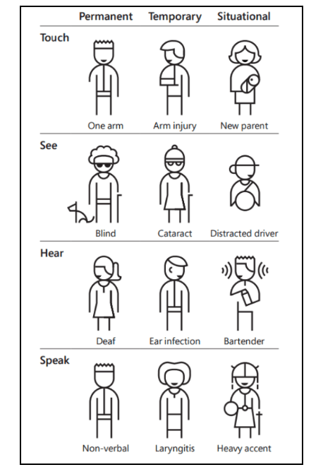
Heather explains that permanent disabilities can be grouped into four main categories:
- Physical disabilities affect how people interact with devices. Conditions like motor neuron disease, cerebral palsy, arthritis, or limb loss can make using a mouse difficult or impossible. Many users in this group rely solely on a keyboard or use assistive tech like switch controls.
- Vision impairments like blindness, low vision, and tunnel vision. These users might zoom in on content, use screen magnifiers, or rely on screen readers (software that reads out page content aloud).
- Hearing disabilities like deafness and hearing loss, requiring captions on videos.
- Cognitive and neurodivergent conditions, like ADHD, dyslexia, autism, and learning difficulties, benefit from clean layouts, predictable interactions, and minimal distractions. Design choices like left-aligned text, consistent structure, and reduced motion can make all the difference.
But Heather points out that it’s not only permanent disabilities we need to consider. Accessible design also supports temporary disabilities, like a broken arm, and situational disabilities, like trying to use a phone in bright sunlight, or one-handed while multitasking. Here’s an illustration from Microsoft’s Inclusive Design Kit explaining the point:
Ultimately, designing for accessibility benefits everyone, which brings us to the next key topic in our discussion: Why should we care about accessible design?
1 in 4 people globally have a permanent disability, and around 80% of disabilities are hidden. Accessible design also caters to temporary and situational disabilities.
Why should we care about accessible design? Because it’s the right thing to do — and inaccessible design costs companies billions
There are many compelling reasons why we should care about accessible design, especially from a business perspective.
Here, Heather points out that accessible design is simply “the right thing to do”, but she also highlights what’s at stake when you don’t consider accessibility. Let’s take a look at what she had to say during our masterclass.
Q. Why is accessibility important for businesses?
First, there’s the moral aspect; it’s 100% the right thing to do. That’s all I really had to say to the leadership team at Skyscanner — “Do you know that we’re excluding people?” And they didn’t, so that was a good enough reason for us to do something; we want to really provide an equitable experience for everyone.
But a lot of organisations also need to understand the commercial benefits. If you design for everyone, you reach a bigger audience, which means greater revenue. The annual spending power of the disabled community in the UK alone is £274 billion a year — businesses don’t want to miss out on that!
Then you’ve got brand loyalty. When disabled people find something that actually works, they come back because there’s not a lot out there that does work really well.
Another thing to think about is reputational damage. And accessible design is really good for SEO as well. Then, of course, you’ve got the legal side; every country has its own laws — like the UK Equality Act 2010, and now we have the European Accessibility Act coming up in June this year, which is a massive one.
If you design for everyone, you reach a bigger audience, which means greater revenue. The annual spending power of the disabled community in the UK alone is £274 billion a year — businesses don’t want to miss out on that.
Q. Can you tell us a bit more about the European Accessibility Act?
It’s the most significant law I think the accessibility industry has seen, and that’s really exciting! It’s something we’re all welcoming because it actually makes our jobs of advocating for accessible design much easier.
The European Accessibility Act affects most businesses operating in the EU, even those that aren’t based in the EU but have customers who are. It includes physical and digital products, but I’ll just talk about the digital product requirements here.
Ultimately, websites and apps must be designed and built to be accessible. So I need to make sure that everyone — designers and developers — knows what they’re doing. We’re doing lots of training, embedding accessibility best practices into our processes, and making sure that everything’s tested. Then we have to make sure that processes are in place for accessibility to be continually met.
Another key requirement is having accessibility statements on your website, so we’re just building ours at the moment. They describe the state of the accessibility of your product and what you’re doing about fixing it. We also have to make sure that customer service is accessible and that people can share feedback with us. There’s a lot more to it, but those are the main things that we’re looking at.
If you don’t comply with the Act, the consequences can be serious: fines, legal action, and in Ireland, companies may even face a prison sentence.
As Heather notes, the European Accessibility Act marks a huge turning point in the industry, compelling businesses to level up and take accessibility seriously.
The European Accessibility Act is the most significant law the accessibility industry has seen. If you don’t comply with the Act, the consequences can be serious: fines, legal action, and in Ireland, maybe even a prison sentence.
Next, Heather takes us behind the scenes of Skyscanner’s accessibility program.
Building an accessibility program: lessons from Skyscanner
Skyscanner is a multi-billion dollar business with over 110 million users every month, and almost 1500 employees across nine offices around the world. The product itself comprises a desktop website, a mobile website, and apps for both iOS and Android.
At Skyscanner, accessibility isn’t a box-ticking exercise or an add-on. It’s a long-term commitment built right into the foundations of how the company designs, develops, and delivers their digital experiences.
Accessibility is not a quick fix. It takes so long to embed it properly into a business. It’s a fascinating process, but there’s so much to it.
So, how do they do it? Here, Heather talks us through Skyscanner’s approach to accessible design.
Q. Can you talk us through Skyscanner’s approach to accessible design?
Our accessibility program has been going for five years, and we’ve been tracking the maturity of our program since 2020 using AbilityNet’s digital accessibility maturity model, which measures progress across five key areas: vision, leadership, processes, capability, and procurement.
We’re still not there yet, but we have made such good progress over the past five years. I want to get the point across that accessibility is not a quick fix. So, companies that are just starting to look at accessibility now, hoping to be all compliant and ready by June, it’s not going to happen overnight. It takes so long to embed it properly into a business. It’s a fascinating process, but there’s so much to it.
Q. How do you integrate accessibility into your processes?
From a design process perspective, we have a briefing template that includes a section about accessibility. So we’re asking our designers to exercise inclusive design thinking from the very beginning, so thinking about how their designs will work for someone who can’t see the screen and someone who can’t use a mouse, and a number of other different disabilities.
We have checklists in place, which are part of the broader quality checks that designers have to go through before they hand over designs to engineering. And then part of that handover is a huge design specification that now has an accessibility section in it.
We also use a number of different tools to mark up our designs in Figma to show engineers what we want from them in terms of accessibility. One such tool is a free plugin from eBay, called Include. It takes you through all of the checks or all of the annotations that you want to make to a design.
From an engineering perspective, we have a design system called Backpack where we’re working hard to make all the components as accessible as possible. There’s also some guidance in there, which is open source. Our engineers are also using best practices during the build process, and we push for product testing both during and after the build, combining automated and manual checks, and we encourage testing with real users.
Beyond that, we track our accessibility score (from automated checks) once a week to make sure we’re going in the right direction.
Q. And how do you build the necessary skills and capabilities in-house?
We’ve got a wonderful champions network. Over a hundred of our 1500 staff are signed up as accessibility champs, and they’re all in different teams around the business. Their role is to be the voice of our disabled travellers and advocate for accessibility in whatever they’re doing.
We also provide extensive resources and training, including screen reader training, which really helps.
All new starters are introduced to accessibility from the get-go. We put them through an empathy lab where we simulate different disabilities, which is part of a two-day global induction event.
Empathy is the ultimate foundation for more inclusive design, and labs are an excellent way for designers to experience their products in ways they might not ordinarily do so.
In the next section, Heather tells us more about how empathy labs work at Skyscanner, and allows us a behind-the-scenes look at an empathy lab in practice.
The power of empathy and user testing: behind the scenes of Skyscanner’s empathy labs
Heather explains that empathy labs are used to simulate different disabilities. With the help of technology, employees can literally experience their products from a different perspective.
This video captures Skyscanner’s empathy labs in action, showing just how insightful and thought-provoking it can be to encounter different barriers while trying to interact with technology.
But, as Heather points out, empathy labs are just simulations — and, while they’re incredibly useful, she emphasises that there’s nothing better than speaking to someone with lived experience of disability.
Simulations are great, but there’s nothing better than speaking to someone with lived experience of disability.
And of course, empathy is just the beginning. Truly accessible design comes to life through intentional decisions and practices. So how can you prioritise accessibility within your process?
Next, Heather explores the role that designers have to play, and shares practical tips from Skyscanner’s own approach.
The role that designers have to play (plus practical tips on designing for everyone)
If you’re in any doubt as to the power and responsibility you have as a designer, consider the mind-blowing fact that between 70 and 80% of accessibility issues can be avoided at the design stage.
As Heather points out, this puts so much control in designers’ hands. By embedding accessibility into your process from the beginning, you can prevent the majority of accessibility issues. Now that’s huge!
In the following masterclass excerpt, Heather shares specific details about how designers can create more accessible and inclusive digital products.
Q. What are some common design pitfalls that impact accessibility?
So many accessibility issues come from really straightforward things, like low colour contrast. A few years ago, 25% of the bugs in our iOS app were purely related to colour and contrast. We ended up tweaking our brand colour palette and tightening the guidelines around how colours could be used together — and it’s completely transformed how people experience our app.
Other common pitfalls include small touch targets, poor heading structure, complex forms, and inconsistent navigation. But one of the biggest is not considering screen reader users from the start. When you design for someone who can’t see the screen, it often changes the whole design and always makes it simpler for everyone.
Yes! Here are 10 practical tips you can implement for more accessible design:
- Start with inclusive design: Think about accessibility from the very beginning of your design process. The earlier, the better!
- Use sufficient colour contrast: Follow WCAG guidelines for contrast ratios and use tools to check your designs. Poor contrast is one of the most common issues.
- Don’t rely on colour alone to convey meaning: Always use a secondary indicator — for example, pair a red outline with an icon and explanatory text for error messages.
- Keep layouts clean and structured: Use plenty of white space and a clear visual hierarchy to help users navigate more easily.
- Left-align paragraphs: Avoid centred blocks of text, which can be difficult to read, especially for people with dyslexia.
- Give users control over motion: Add pause or stop buttons for animated elements that run for more than five seconds. Uncontrollable motion can make tasks impossible for some users.
- Design for keyboard-only navigation: Ensure users can navigate your design using just the Tab, Space, and Enter keys. If the navigation order is non-standard, make that clear in your handoff.
- Consider screen reader users: This is one of the most complex but important areas. Think about how someone who can’t see the screen will experience your design.
- Make designs fully responsive: Ensure your layout works at up to 400% zoom without breaking, overlapping, or losing content. This benefits all users.
- Involve disabled users in the process: There’s no substitute for lived experience. Include disabled people in research, testing, and feedback loops.
All of Heather’s tips are covered in much more detail on the course (which she helped develop as a Subject Matter Expert). You can learn about the curriculum here: Professional Certificate in Designing for Accessibility.
Q. You recommend involving disabled people in research, testing, and feedback loops. Do you have any tips for how teams can recruit users for testing if they don’t know any disabled people personally?
When I started trying to find people, the first thing I did, which you could also do, was approach charities and ask if anyone was willing to help. I contacted the RNIB, the Royal National Institute for Blind People, and got a panel of five people who were happy to volunteer their time. We paid them.
Some charities do have groups of people who would be willing to talk to you even if you don’t have funding. A lot of disabled people just want things to be fixed, and they’re quite happy to help. But I shouldn’t say that without emphasising: pay them if you can — it’s much better practice to pay.
I also approached Dyslexia Scotland, and we did two wonderful days of testing with a very varied group of people with dyslexia. That was amazing.
Now, we have a small panel who are testing our partner sites, because we’re hoping to badge up our partners, like airlines or online travel agents, who have accessible booking flows. We found people for that panel by putting a shout-out on LinkedIn, and sometimes people contact us directly to get involved.
There are also companies like Fable, which have a panel of over 500 disabled users who can test anything that comes their way. They’re great. There are other companies like them too, who have panels and can manage the process for you. But that’s how I did it — I just approached charities.
Certainly! Here’s a round-up of tools I can recommend:
- Include (Figma plugin): Created by eBay, this helps with annotating designs for accessibility within Figma.
- Stark (Figma plugin): Useful for checking colour contrast and simulating colour blindness directly in your design files.
- Accessibility Insights (Chrome extension): Great for running quick accessibility audits and checking tab order during development.
- Funkify.org: A Chrome extension that simulates different disabilities for empathy testing and remote accessibility labs.
- Google Lighthouse: A free, automated tool that audits accessibility (among other things) and provides a performance score.
- WAVE: Another automated audit tool that highlights accessibility issues directly on the page.
- Skyscanner’s design system guidelines: Partially open source, offering accessibility best practices for design and development.
Measuring success, advocating in-house, and building a culture that cares about accessibility
Heather has shared many valuable insights and practical tips for designing more inclusively, but accessibility doesn’t stop at individual decisions. To create a lasting impact, teams must regularly zoom out and ask: are our efforts actually making a difference? Are we moving in the right direction?
Measuring success is key — whether that’s tracking accessibility-related bugs, monitoring feedback (including feedback from disabled users), or setting internal goals based on WCAG compliance.
Another crucial step (and often a very challenging one) is making accessibility a shared responsibility across the organisation — not just something for designers to worry about, but something that product managers, engineers, marketers, and leadership care about, too.
It’s all about building accessibility into your culture, and it’s an ongoing process. People might be sick of hearing me talk about it, but we use every opportunity we can to keep the conversation going. Showing real people either struggling with or benefiting from your product can be incredibly powerful.
That kind of cultural shift takes time and advocacy, and it’s not always easy. But again, we can learn a great deal from Heather and her approach at Skyscanner. Here are some highlights from the masterclass on this very topic.
Q. How do you measure the success of your accessibility efforts?
There are a number of ways, but the best one is simply asking users if they can actually complete tasks on your site or app. From a technical perspective, you can also run automated audits. As I mentioned, these only cover a portion of potential issues, but once you’ve set one up, it’s easy to rerun them regularly to track progress.
There are plenty of tools out there. We pay for a service because we want to check things in detail, but there are free options too, like Google Lighthouse, Accessibility Insights, or WAVE. These plugins can run quick checks and give you a score along with a list of issues to fix.
That said, proper testing requires a manual audit. Automated tools catch less than half of the issues, so we commission third-party audits because they’re complex to do well. Overall, there are many ways to measure accessibility, but Lighthouse is a great place to start. You run it, fix the issues, and watch your score improve.
Q. How did you get Skyscanner to invest in accessibility?
Our primary value is “we think traveller first,” and the business genuinely makes decisions based on that. If something isn’t right for the traveller, it doesn’t happen. The reality was, people just weren’t aware. No one had gone to leadership and said, “This is really inaccessible, we can’t do this.” Once I did, they wanted to fix it. It’s an inclusive company, so the idea of excluding anyone just wasn’t acceptable.
I remember the first empathy lab we ran; it was in the Glasgow office, and people loved it. Then we did it in Edinburgh and London. Getting leadership to try it was key. Once they did, the reaction was: “Where else can we do this?” Now it’s part of global induction sessions.
When I first started, I asked for 20 minutes to speak at induction, and they said there wasn’t time. A few years later, they came to me and asked if I’d run a two-hour lab instead. That shift says a lot.
I know I’m lucky — many companies aren’t like Skyscanner. In a lot of places, the first question is, “What’s the ROI?” And that can be tough to answer.
Q. How do you get different teams (design, product, engineering, and QA) aligned on accessibility?
Through years of not stopping talking to them! It’s all about building accessibility into your culture. If it’s not part of the company’s overall strategy, it’s hard to get traction. Designers and engineers are motivated by different things, so it helps to speak their language and invest in tailored training.
One thing we’ve found really effective is running weekly open sessions: one for designers and one for engineers. They can drop in, ask anything, and discuss specific challenges. It’s just me and one team member — he’s an engineer — so together we can offer a good balance of perspectives.
It’s an ongoing process. People might be sick of hearing me talk about it, but we use every opportunity we can to keep the conversation going. Showing real people either struggling with or benefiting from your product can be incredibly powerful. When you see the impact, you want to do better. So just keep at it constantly!
If this is something you’re struggling with at your own company, the Professional Certificate in Designing for Accessibility has a dedicated module on advocacy, showing you how to champion inclusive design, communicate its value effectively, and get buy-in from key stakeholders.
Wrapping up and thinking ahead
Heather and the team at Skyscanner set a truly remarkable example for how accessible design can look in practice — and the impact it can have on a company’s success.
Importantly, Heather’s insights highlight that accessibility is not a one-time fix; it’s an ongoing journey that requires continuous effort and commitment from both individuals and organisations, but the effort is truly worth it. By embedding inclusive thinking into our daily processes, testing with real users, and consistently advocating for accessibility, we can create digital products and experiences that are open to all.
Looking ahead, the Web Content Accessibility Guidelines (WCAG) continue to be the global benchmark for accessibility standards, with laws around the world increasingly aligning with these guidelines. The European Accessibility Act, for example, marks a major milestone in accessibility legislation, adding more urgency to the topic as regulations become stricter. Meanwhile, the W3C is working on WCAG 3.0, which will further address areas like neurodivergence and a broader range of devices — although this update is still a few years away.
To explore these topics in more depth, we encourage you to watch the full live virtual masterclass with Heather and check out the UX Design Institute’s Professional Certificate in Designing for Accessibility for hands-on training in the field.
And, for further industry guides and insights, check out the following:
- The biggest UX design trends shaping the industry right now
- How to persuade your manager to invest in UX
- Accessible vs. inclusive vs. universal design: what’s the difference?
