Designing a user interface that can quickly be understood and utilized by your users can be the difference between users loving your design and users being frustrated by it. But what makes a user interface intuitive? That’s the question we’ll answer in this blog post. This article explores the principles, tips, and steps to take to design an intuitive user interface. Let’s get started!
What exactly is a user interface?
A user interface is what a user and a computer use to interact. This can be a display screen, a mouse, a keyboard, or any other element where the user is able to interface with the computer.
The user interface is fundamental to a product’s overall user experience and the purpose it serves. So a user interface on a desktop computer is different than a user interface for a virtual reality application. While you need to use a mouse and a keyboard, for example, to interact with a desktop computer, you need only your body to interact in virtual reality.
User interface design, then, is the process of designing how interfaces look and behave, including the screens you navigate, the buttons you click, and anything else required in the system.
Why does intuitive UI design matter?
The “intuitive” in “intuitive UI design” means that users are able to understand a UI’s behaviour without help. This includes things like: it’s easy for a user to find what they’re looking for and they know almost automatically how to interact with the interface.
Intuitive UI design matters because it can be the difference between a user coming back to your product or not. That’s valuable to both the user and the business. When your UI design is intuitive, it means that you as the UI designer have found the right combination of factors like simplicity, consistency, feedback, and common standards.
The key principles of user interface design
There are several key principles that contribute to intuitive user interface design. These include:
Consistency
Consistency in things like visual design, typography, colors, layout, and navigation should help users predict how future interactions will work based on their current interactions with your product. This will enable them to build mental models of how your product works and navigate through it.
Simplicity
Simplicity means the UI is straightforward and easy to understand, ensuring the cognitive load on users won’t be too great. As a result, users will be able to navigate through your product without concerns that they could click on something incorrect.
Stick to common standards
Don’t fall prey to the temptation to reinvent how people do something like finding a file or closing a pop-up. Standards for these things have already been set and users have come to expect certain things. As a result, don’t stray from these standards without a very good reason.
Provide feedback
Make sure that you consistently give feedback on what your user does. Whether it’s a swirling animation that lets them know a new page is loading or a popup that lets them know they’ve clicked an incorrect link, interfaces that show users what they’ve done, both correctly and incorrectly, can be a huge help.
How to design intuitive user interfaces: 4 steps
To design an intuitive user interface, follow these four steps.
1. Understand your users
Your users should be at the core of everything you design. This ensures the final product meets their needs and expectations. Keep your design user-centric by performing user research such as interviews, surveys, and other methods to get insight into your target audience. Alternatively, you can use analytics or feedback to understand your users as they interact with your designs. Whatever you use, data from real users will be key to designing an intuitive user interface.
2. Use familiar conventions in your design
Make sure that you’re using familiar conventions throughout your design, such as these 10 user interface guidelines. Simplicity is important. Avoid clutter and make sure there are no elements that could confuse or distract your users. In addition, your UI should be consistent with its use of colours, fonts, icons, and other elements so that your users can learn and remember how to use them.
3. Leverage common design patterns
A design pattern is a reusable solution to common user interface issues such as forms, navigation, or search. If you use common design patterns, your users won’t have to re-learn the rules of how to use your interface. Instead, your interface should look and behave like other user interfaces but dressed up to fit your UI’s business.
4. Test and iterate
Testing your design with real users will help you understand what you might have missed about users’ expectations and allows you to fix it before your design goes live. Iterating your designs also lets you improve your interface, making it more effective for your users.
Tips and best practices for intuitive user interface (UI) design
Make things easy to find
When you first come to a screen the user will want to find certain key things. For example, the navigation, the search function, and the settings. Those should all be easily discoverable on the page, and they shouldn’t move around from page to page.
Take the Slack app, for instance. When you come to the first page of the app its most prominent feature is a big white block — the message box where you can type in a person or a group’s name and start messaging. It brings you straight to its main functionality. However, if you look closer, you’ll see plenty more right there, including your messages, the channels you belong to, and the people you’ve exchanged direct messages with. A new user can quickly and intuitively find what they’re looking for — and if they can’t, they can search for it in the search bar at the top of the page.
Use affordances to let users know what the UI will do
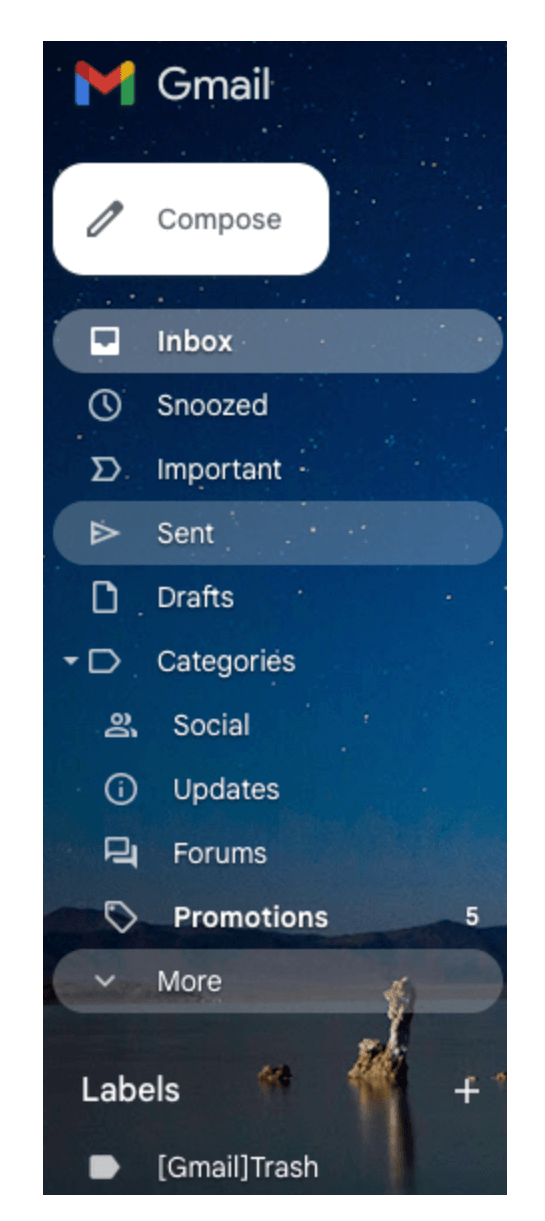
Affordances are visual cues about how an element should be used by a user. For example, if you click on a “+” button, you expect that it will allow you to add something. And if you click on an “x” button in a pop-up, you expect it to close the pop-up.
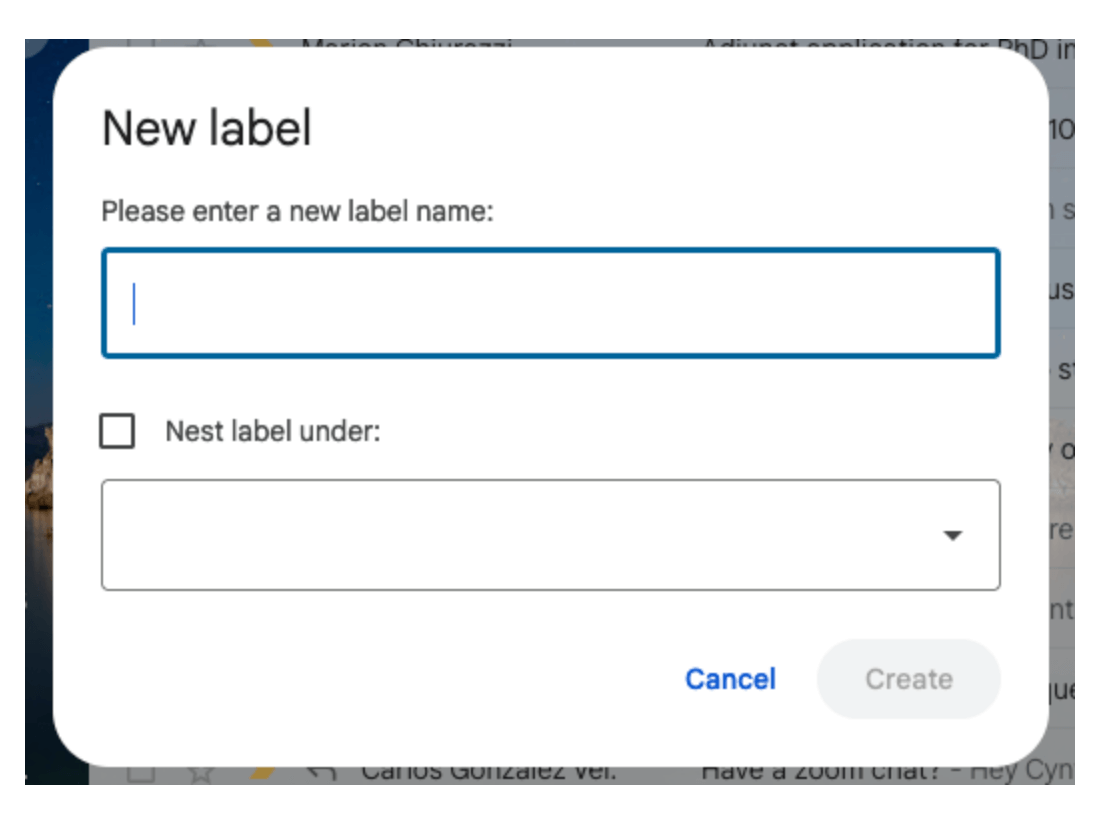
You can see this in action on GMail when you click the “+” button next to the “Labels” header. This allows you to add a new label right away, streamlining the process, and it is intuitive to use this button to do so.

Users may be scared to make mistakes on your website or app. Therefore forgiveness will go a long way to help them feel more comfortable. Forgiveness allows the UI to fix an incorrect action by the user.
Google search is a great example of forgiveness. You can type the wrong thing into the search field and Google will determine what you meant to type and search for that instead.

If your product is truly intuitive it must be accessible to all users. This means even those with disabilities, such as blindness or deafness, must be able to use your product. Your product becomes more accessible when you incorporate features like screen readers, high-contrast modes, and voice control into it. For instance, if you want blind people to enjoy your website, make sure it gives auditory feedback along with visual feedback.
The takeaway
Intuitive user interface design is valuable for the user and for the business. The key principles of intuitive user interface design are consistency, simplicity, sticking to common standards, and providing feedback. To design a great intuitive user interface you need to understand your users, use familiar conventions in your design, leverage common design patterns, and test and iterate. Finally, here are some tips for designing intuitive user interfaces: Make things easy to find; use affordances to let users know what the UI will do; allow your users to make mistakes; and think about accessibility. If you create an intuitive user interface, users will be happy and come back again and again, and the business will thrive.
If you’d like to learn how to create intuitive user interface designs, consider the UX Design Institute’s Professional Certificate in UI Design.
And if you’d like to read more about UI design, check out The Impact of Microinteractions on UI Design, 8 UI Design Dos and Don’ts, and A Complete Guide to the UI Design Process.


