GUI stands for graphical user interface, and it represents a crucial layer between humans and technology.
Without graphical user interfaces, we wouldn’t be able to enjoy our favourite mobile apps, work effortlessly on laptops and computers, or navigate everyday tasks like checking the weather and getting directions.
GUIs are essential for making sure that technology is approachable, accessible, and intuitive.
But what exactly is a graphical user interface? And what are the golden rules and principles for effective GUI UI design?
Keep reading—we’ll cover everything you need to know in this guide.
What is a GUI? A definition
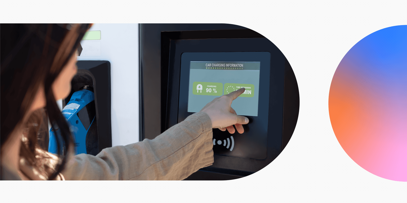
A GUI, or graphical user interface, is a visual system that enables users to interact with machines—be that a smartphone app, an ATM machine, or a smart refrigerator.
A GUI is made up of many different elements such as buttons, menus, icons, and windows. Collectively, these elements make the technology behind the GUI more accessible and easier to use.
Graphical user interface vs. user interface: what’s the difference?
The broader term ‘user interface’ encompasses all the different ways a person might interact with a product—typing on a physical keyboard, for example, or using voice commands to instruct a virtual assistant like Amazon Alexa. It’s like a bridge between humans and technology.
A graphical user interface (GUI) is a specific type of user interface that relies on visual, graphical elements.
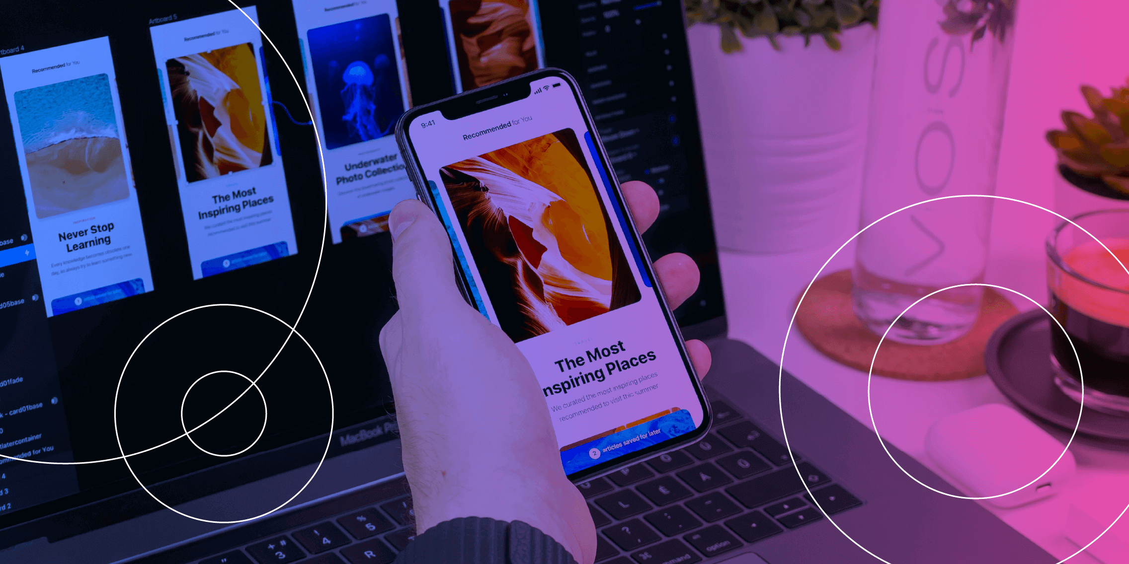
Consider using a smartphone app. You’d typically use your fingers to interact with your phone’s touchscreen, tapping on buttons and icons that you see on the screen. Similarly, if you’re working on a laptop, you’re interacting with the GUI provided by your laptop’s operating system—like Windows or macOS.
Now we’ve got a working definition in place, let’s briefly explore the history of graphical user interfaces.
A brief history of graphical user interfaces (GUI)
Graphical user interfaces emerged as a way to make computers more user-friendly and accessible.
Before GUIs, the most common way to interact with a computer was through a text-based interface—where you had to type commands to instruct the computer to complete certain actions.
This wasn’t particularly user-friendly. Using a text-based interface required some technical knowledge, which meant that only a narrow group of people could benefit.
Then, in 1973, Xerox PARC released the first ever computer to feature a graphical user interface: the Xerox Alto. This marked the first major breakthrough in the history of GUIs, introducing now-familiar elements such as windows, icons, and a mouse.
It wasn’t a commercial success, however, and the concept of GUIs only really started to gain momentum in the early 1980s when Apple launched the Lisa—the first desktop computer with a GUI that was marketed to everyday consumers.
Not long after that, Apple released the Macintosh—a more affordable option that brought GUIs to a mass audience. Around the same time, in 1985, Microsoft brought out the first version of Windows.
Since then, GUIs have evolved significantly into the intuitive, polished experiences we’re familiar with today—and they’ve been absolutely pivotal in making technology accessible, efficient, and engaging.
What are the main components of a GUI?
As we’ve established, GUIs are all about usability and accessibility. They bridge the gap between human users and technology, providing us with the elements and visual guidance we need to make the most of our favorite apps, software, and gadgets.
So how do they achieve this? What are the building blocks of a user-friendly GUI? Let’s take a look:
- Navigation components: elements that help the user move around the interface and find specific content. This includes things like menus, toolbars, navigation bars, and breadcrumbs.
- Interactive components: this includes all the various components a user needs to interact with the system and perform certain actions—think buttons, sliders, toggles, dropdowns, and text input fields.
- Informational components: such elements guide the user by providing additional context, information, or feedback in the form of notifications, pop-up messages, progress bars, and tooltips.
- Containers and layout components: elements that organize and structure content within the GUI, such as grids, panels, and cards (we’ve written more about card UI design here).
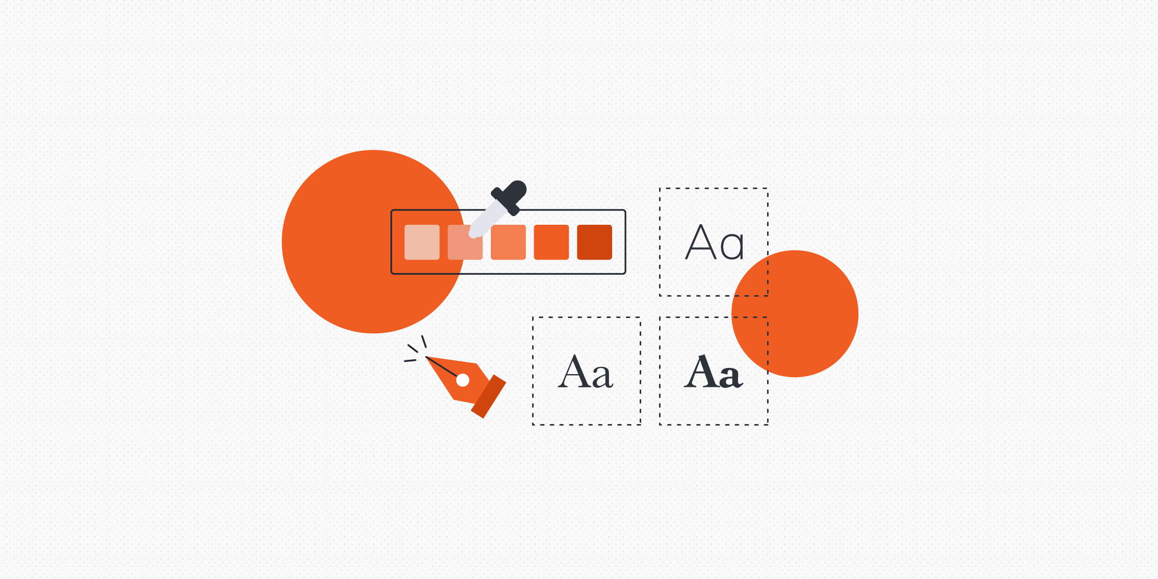
- Visual design elements: this includes all elements that help to enhance the interface’s usability and visual appeal, such as typography, images, icons, and colour schemes.
Those are the essential elements that make up a graphical user interface (GUI). Now let’s consider the guiding principles that help bring these elements together.
10 key principles of UI design for graphical user interfaces
When it comes to creating graphical user interfaces, all the golden rules of UI design apply. The following principles ensure that the GUI is efficient, intuitive, and visually appealing—everything that’s needed for a positive user experience.
1. Consistency
The consistency principle is all about maintaining uniformity in design elements across the board. This means that colours, fonts, icons, and layouts should be consistent throughout the interface.
This is not only important from a visual branding perspective. It also helps users to build familiarity with the interface and predict how different components behave—reducing their learning curve with the product.
2. Clarity
The GUI should be as clear and self-explanatory as possible. You don’t want the user puzzling over what something means or how something works; it should just inherently ‘make sense.’
Clear labels, accessible terminology, simple icons, and logical layouts all help to enhance clarity and reduce confusion within the GUI.
3. Feedback
Designing a graphical user interface (GUI) is like facilitating a dialogue between the user and the system. As such, the GUI should provide timely and meaningful feedback whenever the user completes a certain action.
When clicking a button to submit a form, for example, the user will want some kind of confirmation that it’s been submitted successfully. Likewise, if there’s an error, the GUI needs to tell the user what’s happened and guide them back on track.
4. Accessibility
The primary function of a GUI is to make technology and computers accessible—and that means accessible to everybody, not just a certain group.
The accessibility principle serves as an important reminder to design for all users, including those with disabilities. This requires conscious and thoughtful design choices such as using readable fonts, ensuring sufficient contrast between text and background, and adding alternative text (alt text) to images.
5. Flexibility
Where relevant, users should be able to customize their experience with the GUI. They might be able to adjust certain settings, for example, or choose from a variety of input methods.
Google Docs is a great example of flexibility within a GUI. Users have many different options for how they can complete certain actions: they can use their mouse to click on menus, use their keyboard to type shortcuts, or use their voice to execute commands.
6. Hierarchy
The GUI should follow a clear visual hierarchy, guiding the user’s attention to different elements depending on their importance. Colour, size, spacing, and position on the page or screen all help to establish hierarchy and pull the user towards primary elements first.
7. Simplicity
The simplicity principle is all about placing minimal cognitive load on the user. In other words, not requiring them to process too much information at once or think too hard about completing a particular task.
A well-designed GUI breaks complex workflows down into smaller, more manageable steps, and presents information in a concise, digestible format.
8. User control
The best GUIs give users control over their actions, enabling them to reverse accidental actions and double-confirm any actions that might have serious consequences.
If you use Gmail, you may have noticed that, within a few sections of sending an email, you have the option to “Undo send.” Similarly, if you want to transfer money using a mobile banking app, you’ll typically be required to review and confirm your transaction several times before it goes through.
9. Visual appeal
In GUI UI design, functionality, usability, and aesthetics go hand-in-hand. No matter what product you’re designing for, the GUI should align with the brand’s visual identity, and it should be clean, clutter-free, and aesthetically engaging.
Consider things like white space and colour theory, and explore trends like neumorphism or flat design to inform your GUI’s overall aesthetic.
10. Error prevention
Last but not least, an effective GUI is built to minimise user error.
Provide clear instructions to guide the user, implement constraints where appropriate (for example: disabling the ‘submit’ button on a form until all necessary information has been entered), and make errors easy to fix by providing helpful messages and options for recovery.
We’ll see all of these principles in action a little later on when we explore real-world examples of great GUI design. But first: some additional best practices to guide you in creating awesome graphical user interfaces.
5 best practices for GUI UI design
1. Research first, design second
The whole point of designing a graphical user interface (GUI) is to provide an intuitive, accessible, user-friendly bridge between your users and the product or system they’re interacting with. So make sure all design work is preceded by extensive user research.
Conduct user interviews and surveys, observe how your users interact with similar products and interfaces, and gather data on their pain-points, goals, and expectations.
Use your research to create personas and journey maps, and ultimately to guide your design decisions. This ensures a user-centric design approach, creating a GUI that feels intuitive and usable for your target audience.
2. Stick to a grid system
To guarantee a clean and organized layout for your GUI, base your design on a grid system.
A grid system is a framework of rows and columns that helps you organize and align elements within your design—keeping things consistent and balanced.
If you’re not familiar with grids, refer to this guide: What are grids in UI design? (And how to use them).
3. Design for all screen sizes
When it comes to GUI UI design, responsive design isn’t simply a nice-to-have. Your graphical user interface must work flawlessly across all devices—whether on a phone, tablet, or desktop.
Take a mobile-first approach, prioritizing essential content and features for small screens first, and then scaling up for larger screens.
It’s also advisable to use fluid grids. This is a specific type of responsive grid that uses percentage-based widths instead of fixed widths, meaning that columns will resize automatically depending on the user’s device.
Last but not least, incorporate scalable fonts and touch-friendly elements to improve usability on mobile devices.
4. Test and iterate
Usability testing is crucial for catching design flaws and friction points before your GUI goes live—and for continuously refining your design even after you’ve launched the product.
Get your designs in front of real (or representative) users early and often. Whether through A/B testing, observational sessions, or heatmaps, optimizing your GUI should be an ongoing endeavour.
5. Leverage the right tools
As with any design project, having the right tools makes all the difference.
Leverage industry-standard UI design tools like Figma, Sketch, and Adobe XD to create wireframes and prototypes for your GUI. For research and testing, use tools like Optimal Workshop, Maze, and UserTesting.
And, if you want to streamline your workflow with AI, consider these AI-powered tools for user research.
Building out your toolstack is essential for achieving great results, whether for GUI design, voice UI design, or designing for AI-first products.
Real-world examples of great GUI UI design
We know what great GUI design looks like in theory—but what does it look like in practice? Here are three familiar examples of graphical user interfaces that are intuitive, visually appealing, and user-friendly.
Great GUI UI design example #1: Apple’s macOS
There’s a reason that Apple products are the go-to for millions of users worldwide. Apple’s macOS is the epitome of clean and intuitive GUI design, combining aesthetics and functionality for a seamless user experience.
With its sleek icons and smooth animations, the Dock ensures effortless navigation. Then you’ve got the Finder: a masterclass in user-friendly file management.
Above all, Apple’s operating system highlights the power of consistency and visual hierarchy with its use of grids, alignment, and carefully chosen typography.
Apple products are famously easy and accessible for both novice and experienced users alike. A great example of GUI UI design done right!
Great GUI UI design example #2: Google Maps
Google Maps is reportedly the most widely used navigation app in the world, so it can certainly teach us a thing or two about great GUI design.
Google Maps offers an interactive, highly responsive GUI that seamlessly integrates navigation tools, real-time traffic updates, and search functionality—all without overwhelming the user (remember the simplicity principle of GUI design?).
Intuitive gestures such as pinch-to-zoom and drag-to-scroll make it ideal for touchscreens, and the clear use of icons, colour-coded markers, and layers (e.g. satellite traffic) helps users interpret complex data visually.
Google Maps is a great example of how a well-designed GUI can simplify even the most information-heavy applications to provide a first-class user experience.
Great GUI UI design example #3: Netflix
Netflix is an excellent example of a graphical user interface that prioritizes personalization and ease of use.
It uses grids to organise content into scrollable rows based on genres, recommendations, and user preferences—ensuring a visually appealing layout and an intuitive user experience.
Netflix’s GUI is also seamlessly responsive across devices. Whether you’re browsing on a phone, tablet, or smart TV, you get full functionality and complete consistency. A solid lesson in smooth and engaging GUI design!
The takeaway
Without graphical user interfaces, many of the digital products and technologies that shape our daily lives would not be accessible. GUI UI design is crucial for bridging the gap between human users and technology, turning complicated systems into intuitive tools that we can all use and enjoy.
That’s the power of great design—and it just goes to highlight the importance of design skills in our increasingly tech-driven world. If you’d like to master the art and process of user interface (UI) design, check out the UX Design Institute’s Professional Certificate in UI Design.
Looking for more design tips and insights? Continue with these guides:
- What is a design system and why is it useful?
- What are the Gestalt principles and how do designers use them?
- What does good UI design look like? 9 examples to delight and inspire you


